Context and Challenge
I was given a brief, a couple of references, and a launch date. Nothing else — no user research, no product requirements. The starting hypothesis was simple: trip planning is broken, and AI can make it better.
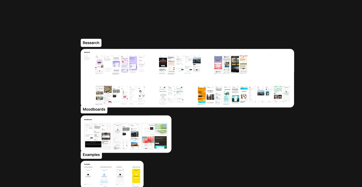
My competitive analysis revealed that most products were stuck at one of two extremes: they could search but knew nothing about the user, or they could hold a conversation but failed to deliver a tangible outcome, such as a completed booking. Expi had an opportunity to own the space between the two.
One product principle aligned the entire experience: an agent that remembers who you are and takes you all the way to booking. In parallel, I explored several visual directions, conducted research, and aligned the team around the final approach.
Discovery
The project started without any user data—only a business hypothesis. My first responsibility was to build the product foundation from scratch: define the product objective, business model, user value proposition, and target audience.
My process was: identify the core Job based on the primary persona → develop two Customer Journey Map approaches → design a trust progression across each stage of the journey.
When I began reviewing the available research, I expected the main problem to be related to hotel search or price comparison. Instead, I discovered that the most critical Job happened before the search even began. An empty search screen creates decision paralysis. People do not want another tool—they want someone to ask, “Where do you want to go, and what kind of experience are you looking for?” They want the product to take the initiative while understanding and applying their preferences.
This insight became the foundation of the interaction model: not a parameter-driven search, but a product-led conversation.
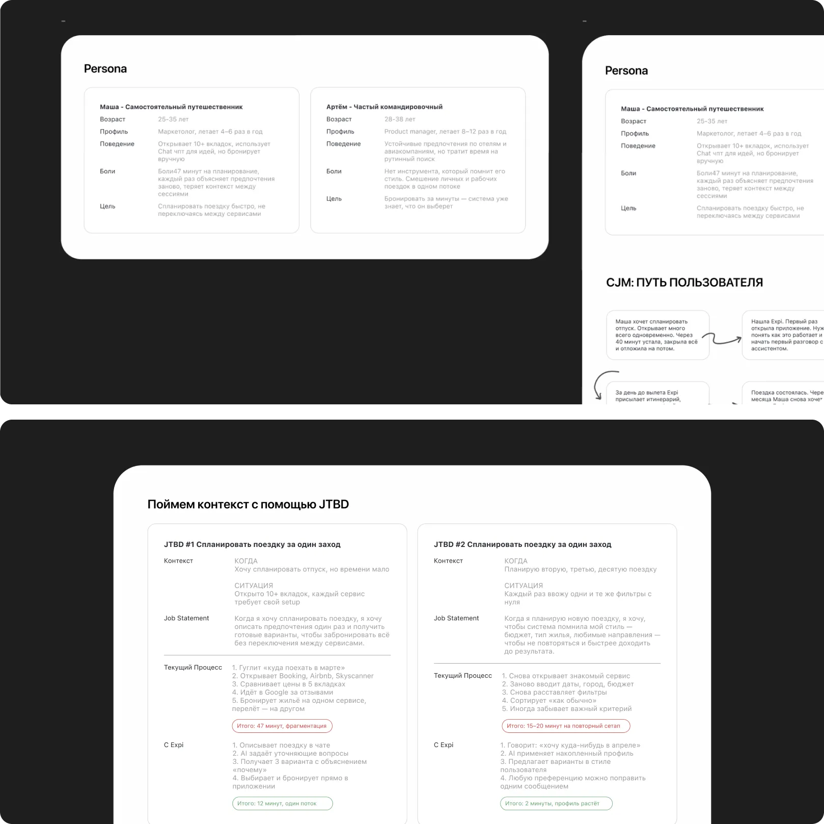
Designing for trust and prioritizing the MVP. Once the Jobs were defined, the next question was what to include in the first release. I approached prioritization in two stages. First, I ranked the Jobs by criticality—which problem created the greatest barrier for the user, and which one had to be solved for the product to work at all. Then, I mapped features to each Job and evaluated them based on user value versus implementation complexity.
Solution and Execution
Once the MVP priorities were clear, the central product question became: what should the interface actually look like?
What we considered
The most obvious option was a hybrid experience: a chat interface combined with familiar search elements such as filters, cards, and sorting. The intention was to reduce the learning curve by grounding the new experience in patterns users already understood.
However, the more closely we examined this direction, the clearer the underlying contradiction became. A hybrid interface solved the interface problem, but not the user problem.
Why we chose a conversational interface
First, the JTBD insight showed that the user’s primary Job was not simply to find a hotel. It was to move past the paralysis of an empty screen without knowing where to begin. A guided conversation removes that barrier.
Second, the competitive analysis revealed a clear gap in the market. Existing products sat somewhere between search and conversation, but none successfully connected the two. A hybrid solution would have positioned Expi alongside those same competitors rather than giving it a distinct role.
Third, the capabilities of AI supported a fundamentally different experience. The model could retain context, clarify preferences, and apply what it learned to future requests. A traditional search interface would not fully unlock that potential.
Choosing a conversational interface introduced a new set of design questions: What should an assistant’s response look like? How does the user know that the system has remembered something? How should the experience behave when the model is uncertain? These questions shaped the next phase of the project: designing the core flows and their edge cases.
Edge Cases
Once the primary flows were established, the most complex part of the work began. The product was most vulnerable in moments of uncertainty: when the model lacked confidence, when the user and the system interpreted the same request differently, or when the conversation moved in an unhelpful direction.
Edge case 1—the AI is uncertain. The simplest solution would have been to display a result without acknowledging that uncertainty. However, this would gradually undermine trust: sooner or later, the user would notice that the recommendation was inaccurate.
I established a different principle: when the model is uncertain, it asks a clarifying question. It does not expose a confidence score or display a generic warning. Instead, it asks a specific question that helps it produce a better answer.
Edge case 2—the request contains conflicting priorities. When a request included contradictions—for example, “something affordable, but with a high-quality hotel in central Dubai”—the system did not silently prioritize one constraint while ignoring another. The assistant surfaced the trade-off and asked the user what mattered most for this particular trip.
It may seem like a small interaction, but it creates the sense that the product is genuinely listening.
More broadly, I see edge cases as the core of UX in AI-powered products. These are the moments when users decide whether to trust the product or abandon it—and that trust directly influences long-term engagement and loyalty.
Engineering Handoff
I began building the design system in parallel with the core product flows.
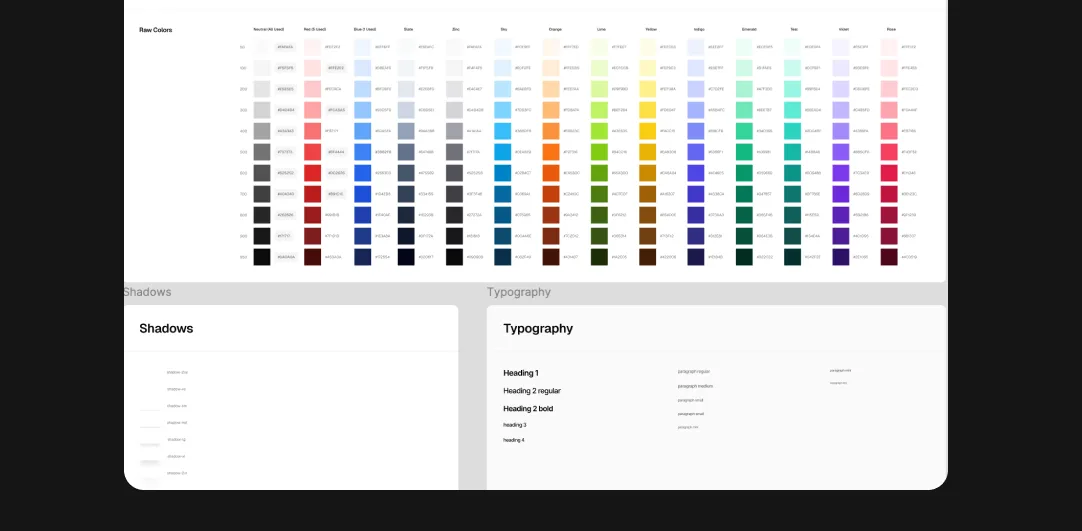
The decision to use an atomic design approach was intentional. The engineering team was small, and there was little time for an extended onboarding process.
The system was built on a foundation of design tokens covering color, typography, and shadows. Tokens were named semantically rather than after literal values—for example, color/background/primary instead of #1A1A2E. This made the system easier to scale and ensured that future theme changes or rebranding would not require individual components to be rebuilt.
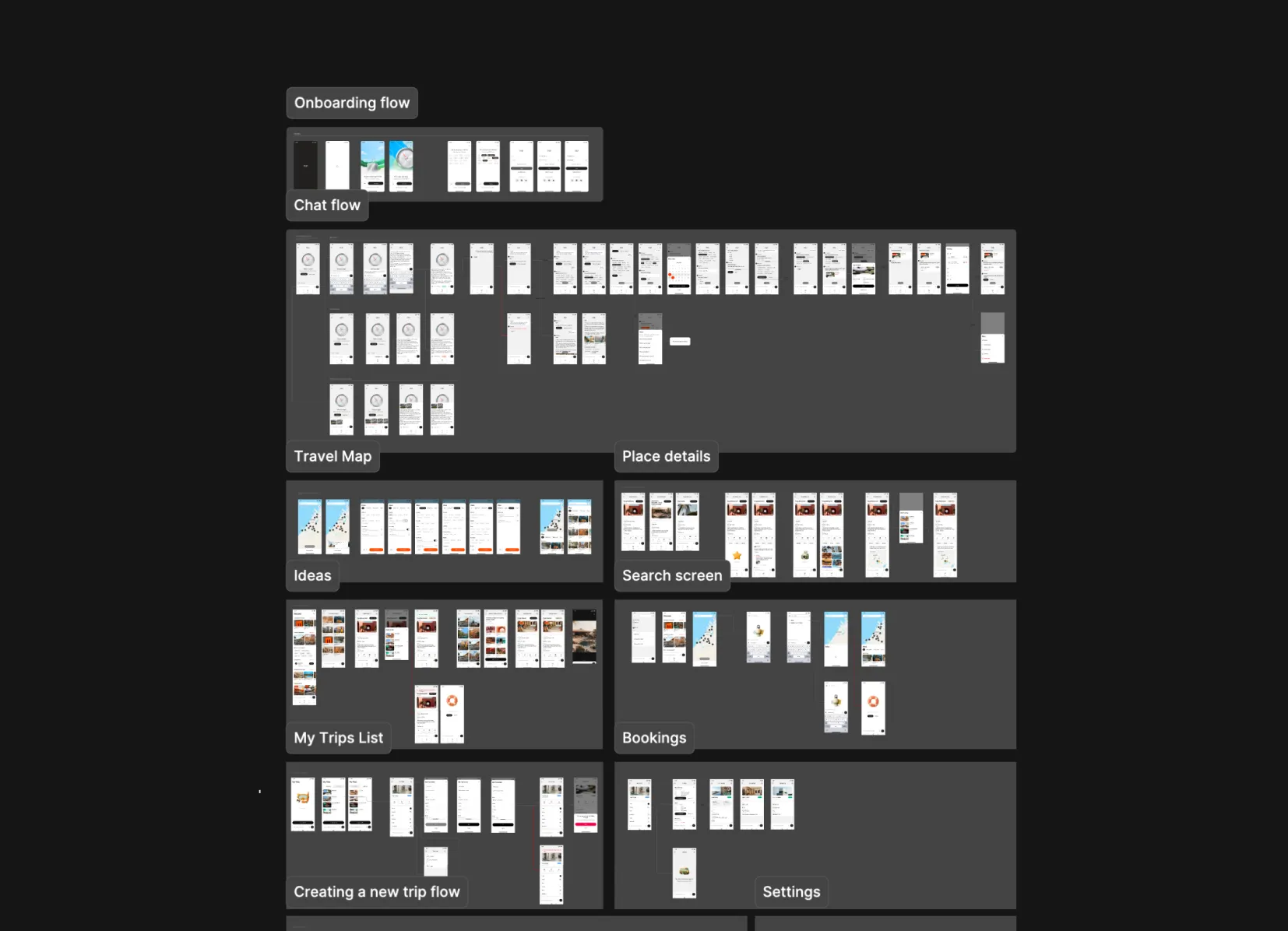
Of the 11 designed flows, three were identified as mission-critical—the experiences without which the product could not function: conversational onboarding, trip planning, and booking with payment. Each flow included empty states, loading states, and the relevant edge conditions.
Outcome
The product was designed from initial concept through engineering handoff within a compressed timeline and without a predefined product concept at the outset.
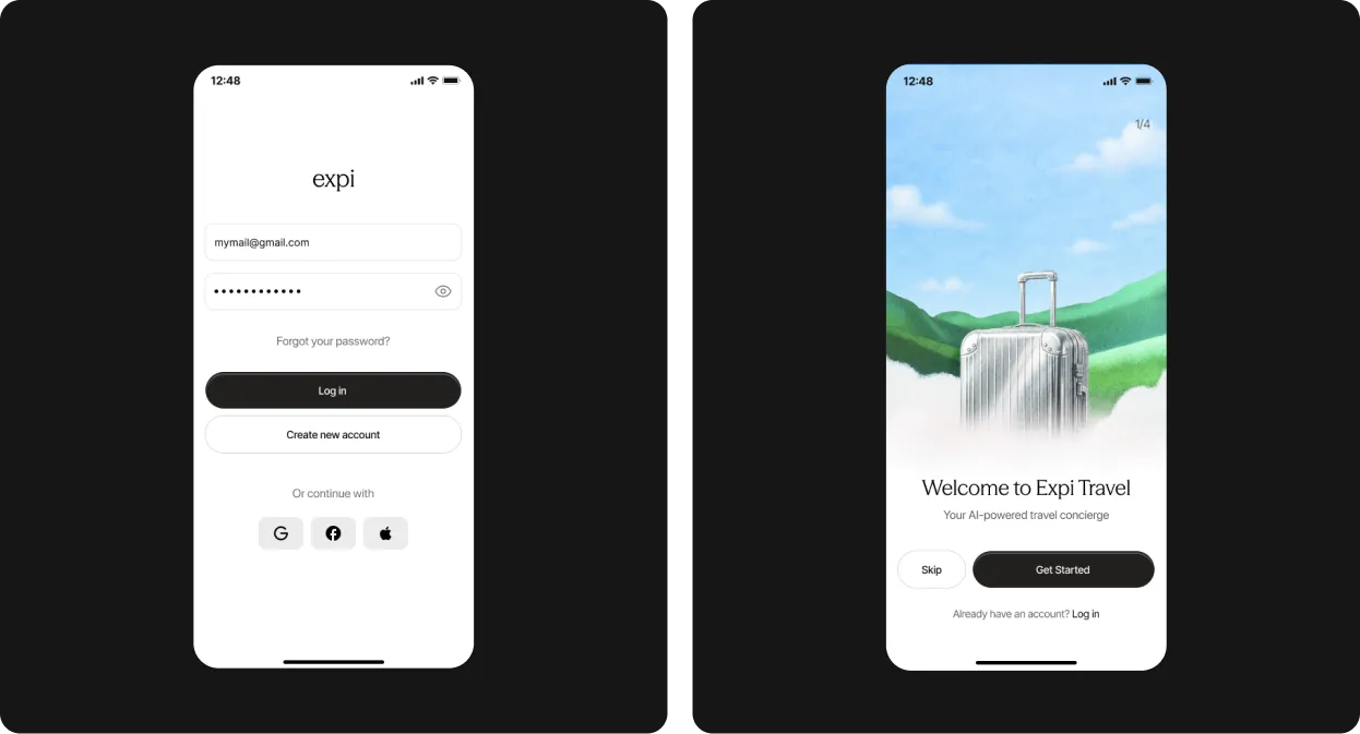
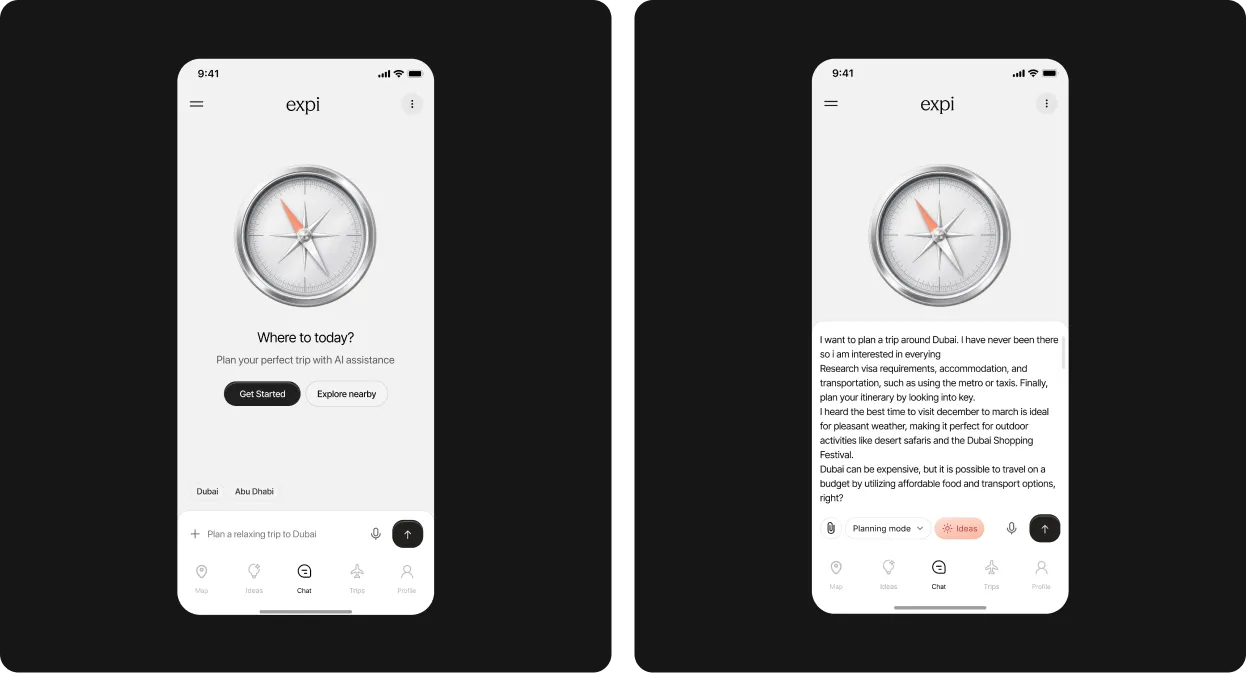
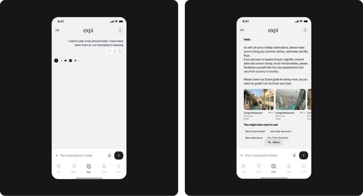
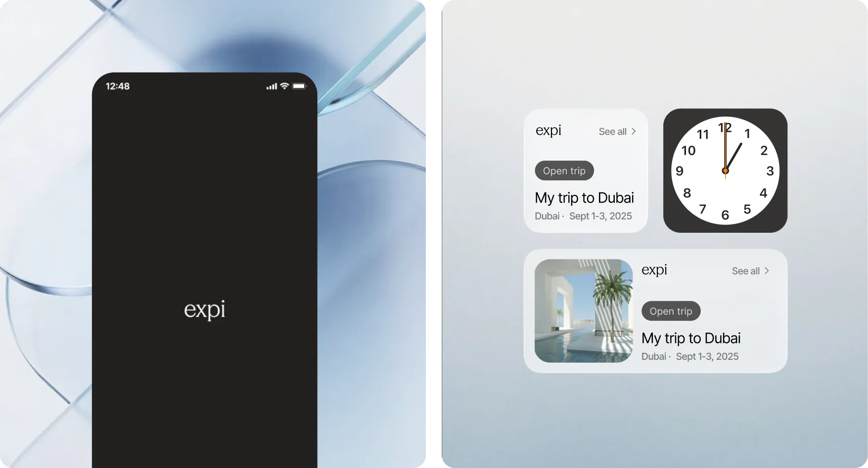
The final deliverables included a complete customer journey from onboarding to booking, 11 fully defined product flows, a scalable design system, and supporting documentation.
If I were to run the project again, I would prioritize usability testing before the engineering handoff. A conversational interface still represents an unfamiliar interaction model for many users, and testing would have helped validate whether every design decision was as intuitive as intended.