Context
Here’s how I ran the design system for BSPB’s online banking: 60+ components, two themes, one shared language across the whole product team.
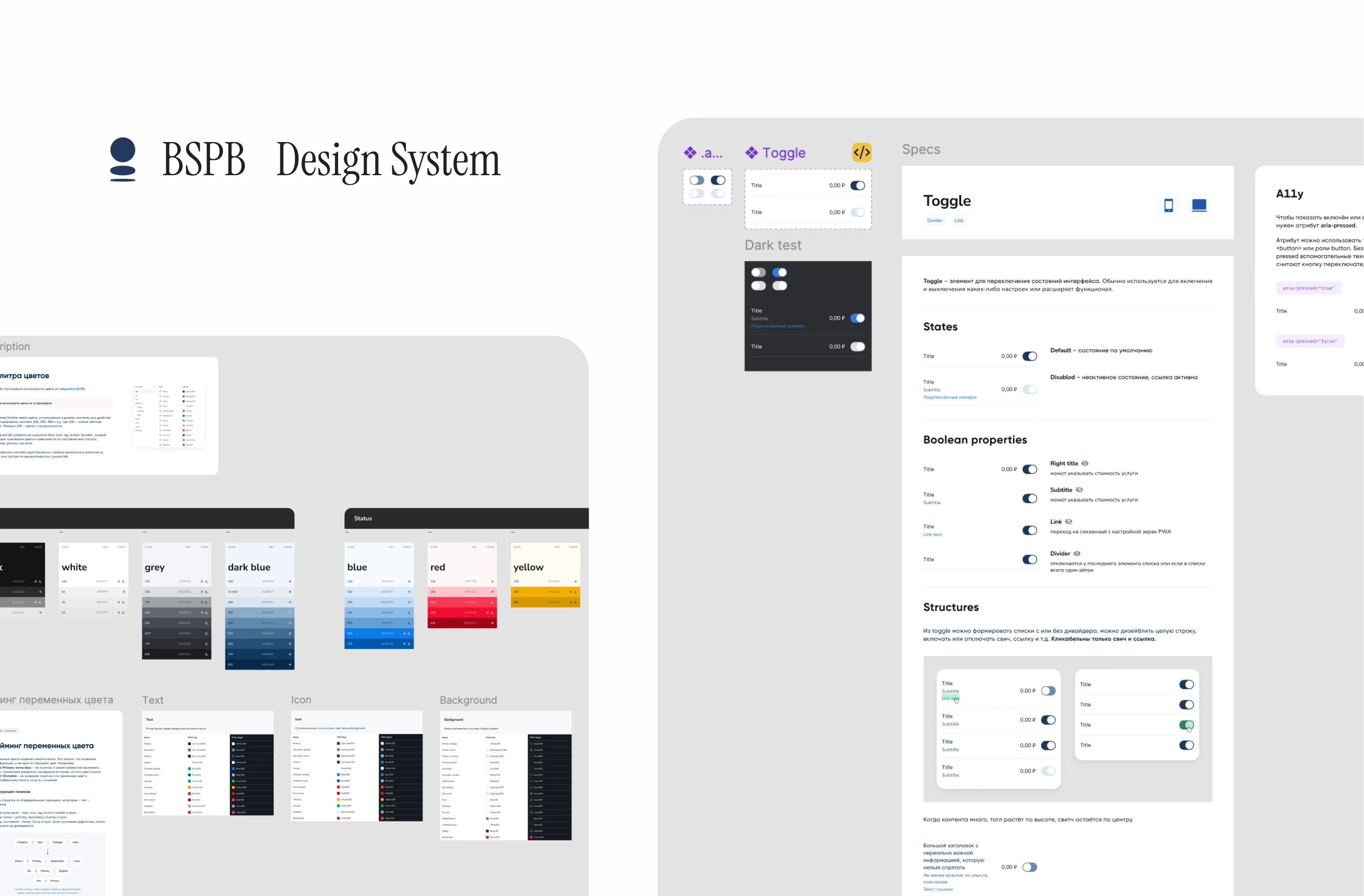 I owned the design system on this project, and I also owned two product areas — Loyalty and Savings. I specced new functionality alongside business analysts and picked up whatever else the quarter needed. So I was the library’s owner and one of its heaviest users at the same time, which is honestly the best thing that can happen to a design system.
The most common mistake, to my mind, is starting with buttons. The system has four groups of variables: Palette, Colors, Spacing, and Corner radii. Every token is defined twice over — once for PWA Day, once for PWA Night. There is no such thing as “the dark version of the mockup” in our files. If a designer built the screen on tokens, dark mode already exists.
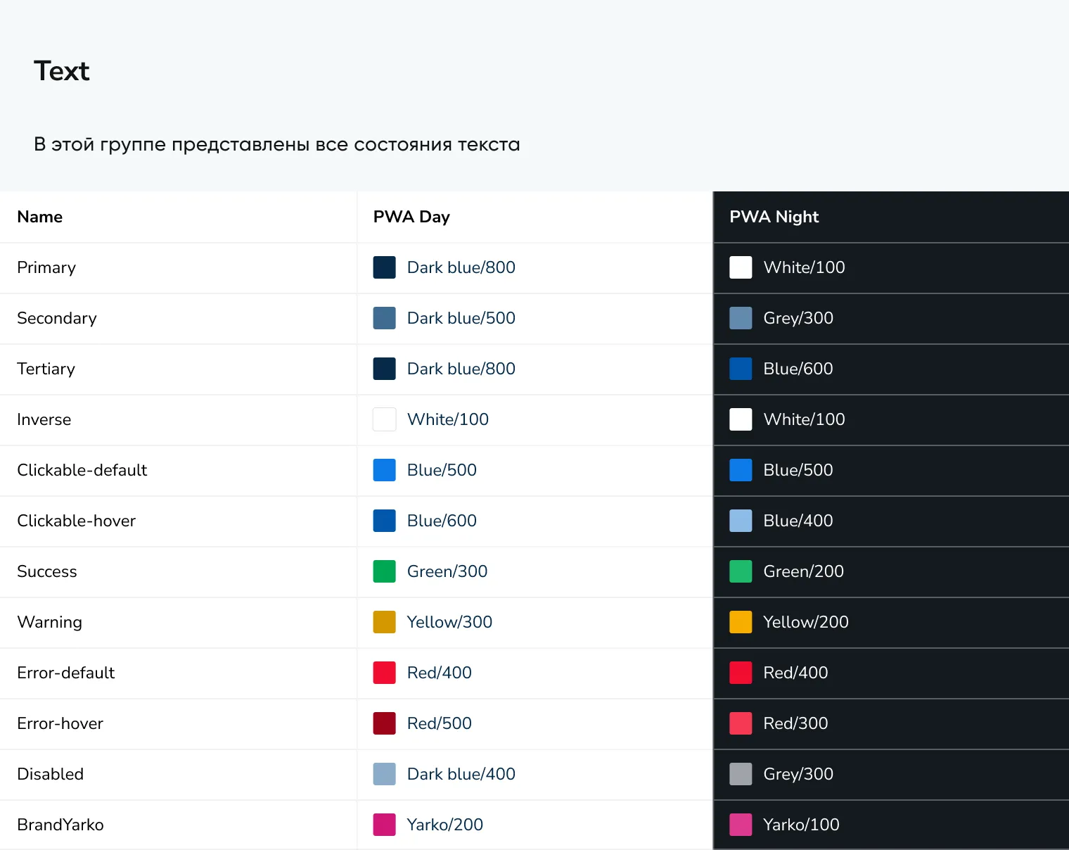
The most important thing I learned in all this: documentation doesn’t have one reader, it has two. A designer and an engineer come to the library for completely different things. So every section is explicitly tagged: for designers, for dev, for dev / designers.
How the palette is built
The first layer is Palette. Just the brand colors, numbered — 100, 200, 300 and up, where 100 is the lightest. Anything below 100 is a color with transparency.
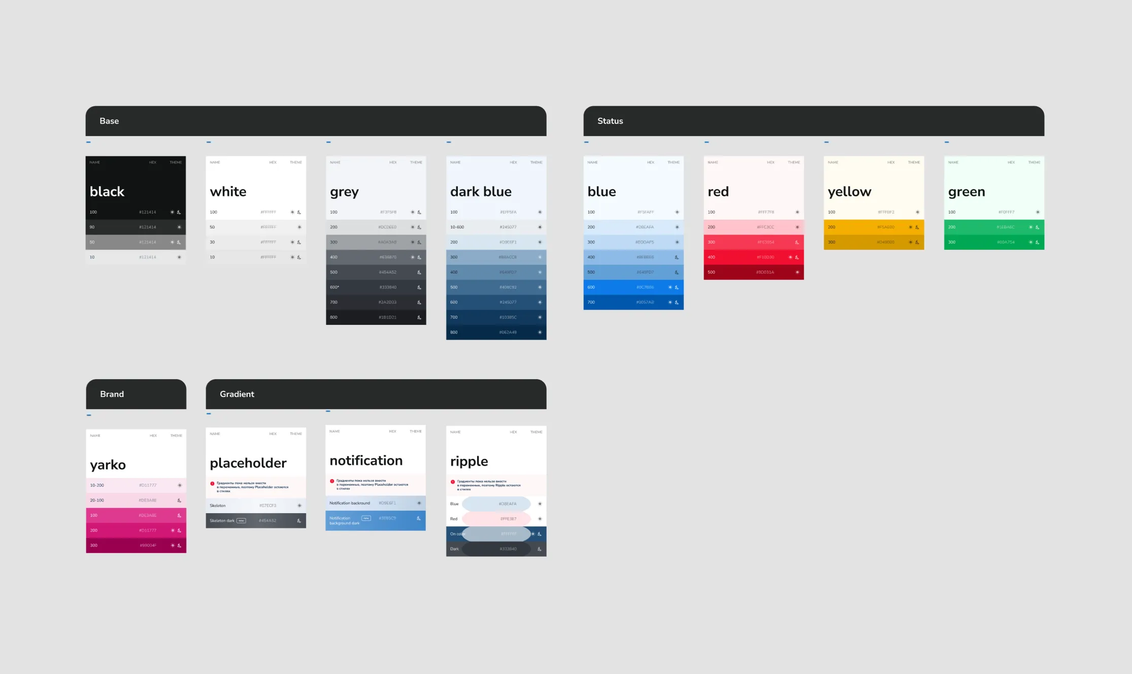
Why? So that a designer never has to hold #245077 in their head. People shouldn’t be memorizing hex — they should be memorizing logic. You can read Dark blue/700 and check it by eye in a second. You can’t do that with #10385C.
The second layer is Colors. And here’s the decision that matters most: the palette is broken out not by component, but by entity — text, icon, bg, button, border.
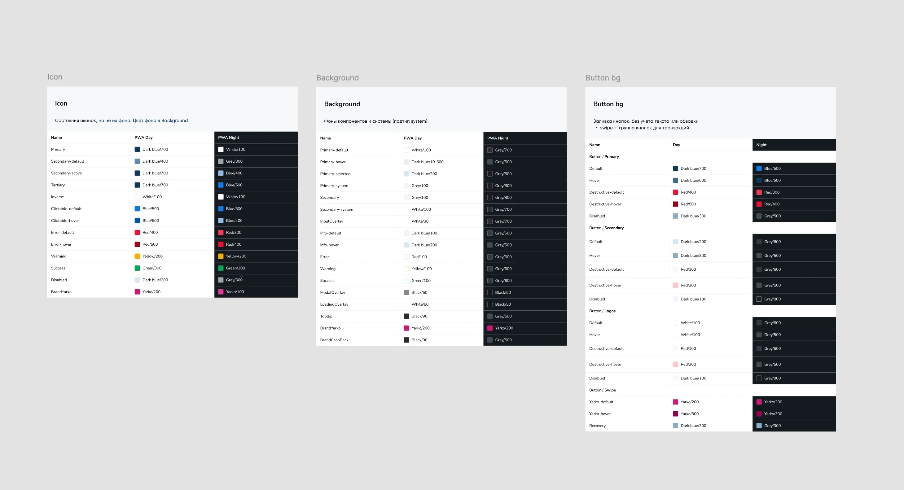
The logic is simple. Every component is made of these same things. An alert has a background, a border, an icon, and text. So does a button. So does a card. Hand out colors per component and the library grows linearly with the product. Hand out colors per entity and the system already covers components that don’t exist yet.
Refactoring fixed everything
Spacing and radii are built on a module: 1 module = 8 × 8 px. Sizes come from multiplying the module by whole numbers and by halves — 8 × 2 = 16 px, 8 × 0.5 = 4 px.
The tokens were originally named like t-shirts: XS, S, M, L, XL, 2XL. It looks familiar, and it works badly. XL tells you nothing about the size — to find out it’s 20 px, you go look it up in a table. And the t-shirt scale runs out: past 5XL you’re improvising.
We moved to module names: XS is now 0.5m, L is now 2m, 3XL is now 4m. Now the name of the token is its math. 3m means three modules, which means 24 px. The scale can keep going forever and it stays predictable.
Same logic in the radius. But here I went further and locked the radius to the height of the component.
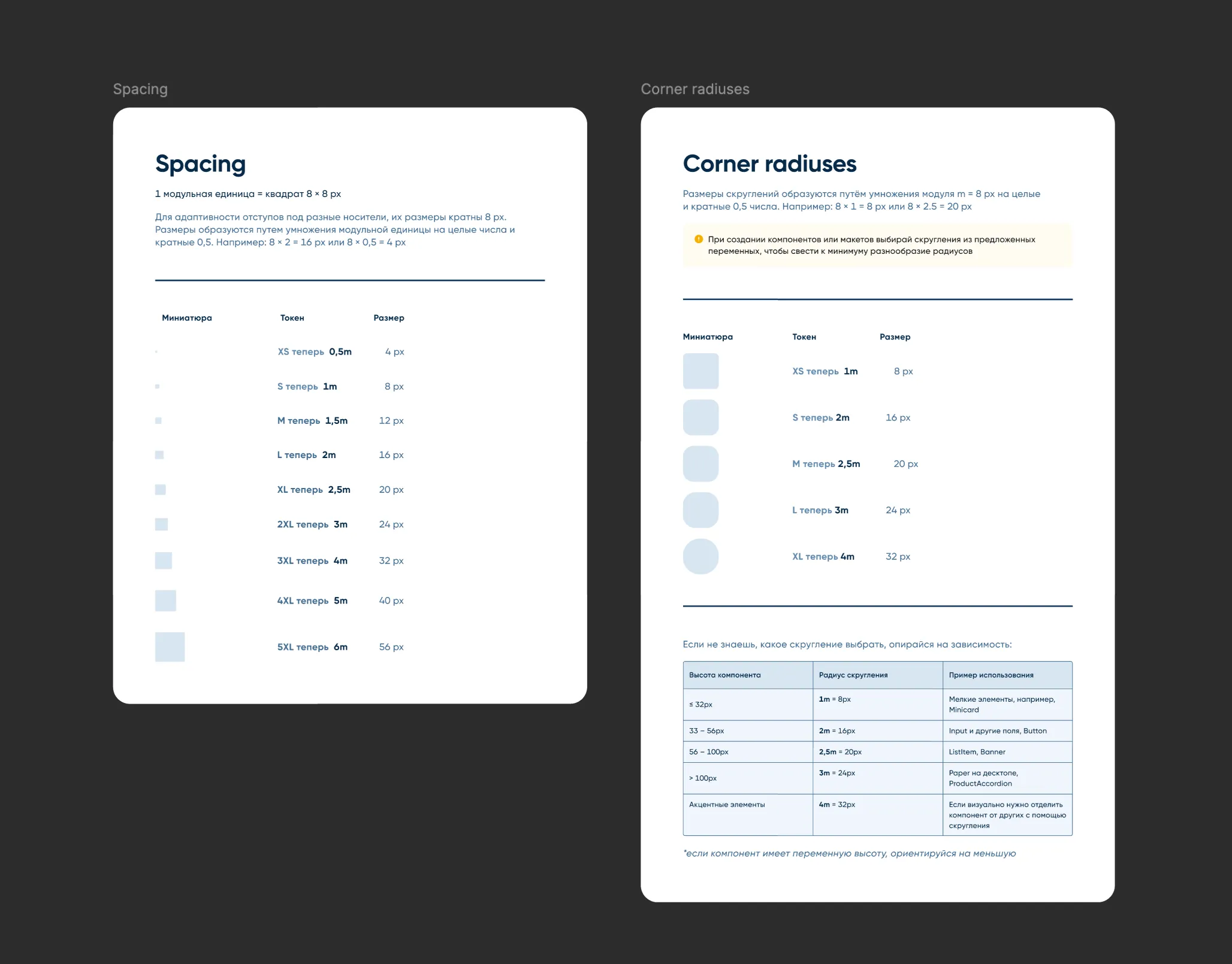
This is my favorite part of the system, and here’s why. A good design system doesn’t just hand you a set of values — it takes a decision off the designer’s plate that never needed making. “What’s the corner radius here?” isn’t a design review conversation anymore. There’s a height, so there’s an answer.
A component is a document
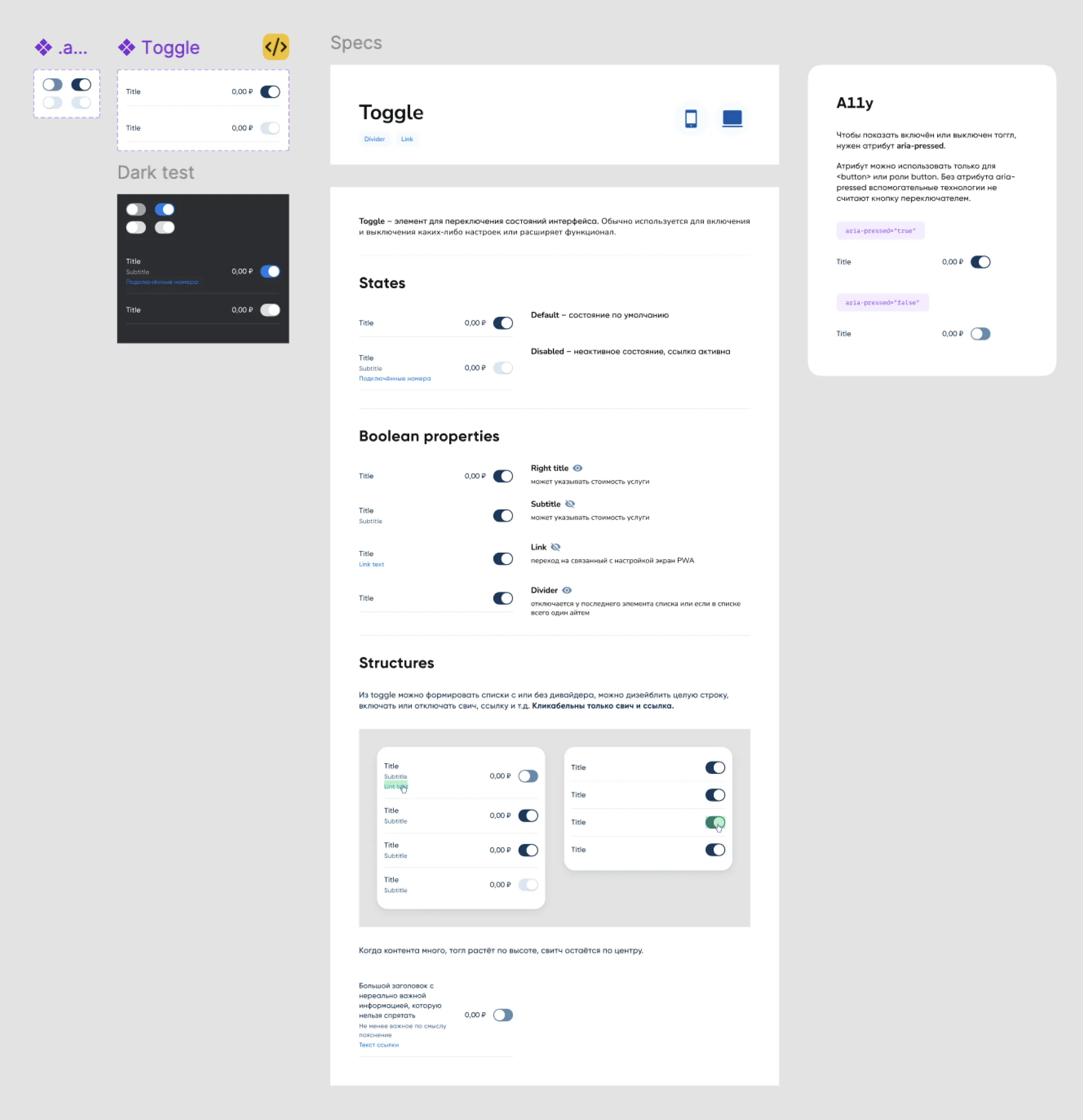
This is the part I’m proudest of. We use an atomic approach, and every component in the library is laid out to the same script:
- Atoms — the smallest building blocks
- Spec — every state, the anatomy, and the usage variants
- Theming — how the component looks in dark mode
- A11y card — accessibility attributes
Patterns: number formatting
A design system stops being a library of pictures the moment it starts describing not elements, but how the product behaves. My favorite case for this is number formatting.
The problem
A bank is made of numbers: prices, transaction amounts, bonuses, rates, statistics. Until the rules are written down, every team invents its own:
- one place always shows the kopecks —
200,00 ₽ - another hides the decimals on whole amounts —
200 ₽ - pluses and minuses land differently —
+200 ₽vs.200+ ₽ - rates get three decimal places,
3,000%, or none at all,3%
Every one of these looks fine on its own. The problem shows up when a user sees them on adjacent screens: unpredictable behavior from UI components, bugs in the handoff from design to engineering, and — the most expensive one for a bank — an erosion of trust. If an amount looks different in one place than another, the user pauses for a second to wonder whether it’s the same amount.
What I did
-
Mapped the scenarios. I found every point in the product where a number appears: input fields, statements, notifications, charts. Then I sorted them into types — currency (₽, $, €), percentages, whole-number counts of bonuses and points, and technical metrics and statistics.
-
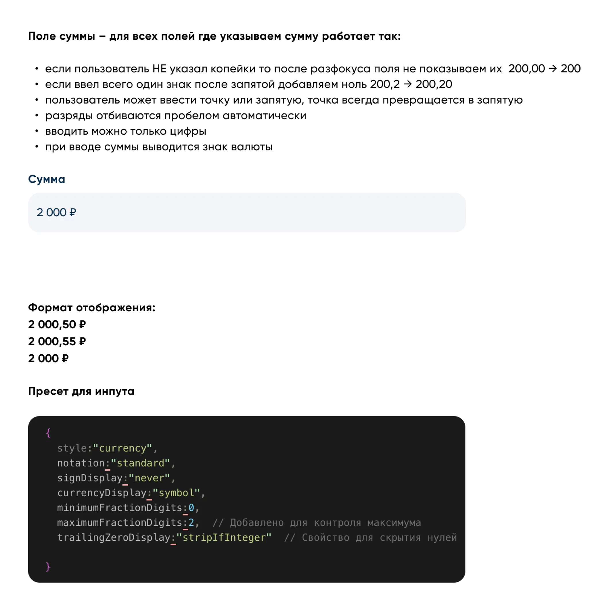
Wrote rules for each type. The amount field, for example, works like this:
-
Took it all the way to code. An engineer and I built the formatting presets together — an
Intl.NumberFormatconfig for each number type. To my mind, this is the key moment of the whole case. I documented the result in the design system with preset tables and before-and-after examples.
The result: numbers stopped being a matter of one team’s taste. A designer doesn’t choose a format — they choose a type of number.
What I took away
A good system removes decisions, it doesn’t add options. The height-to-radius table. One shadow. A deliberately limited list of token types. Every time I close a question with a rule, the team gets back a little attention to spend on the problems that are actually hard.
And yes — being the owner and the user of the system at the same time is the best debugging mode there is. I ran Loyalty and Savings on this same library.