Overview
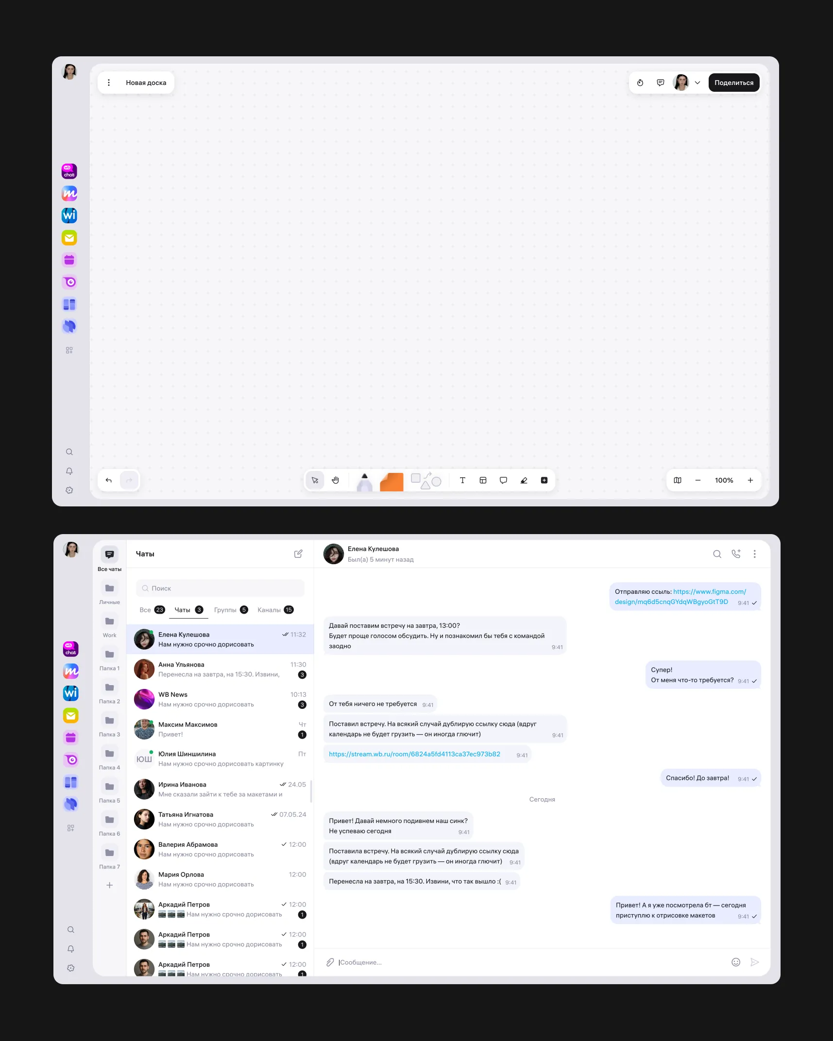
An internal workspace for employees at a large e-commerce company — the kind of suite you’d normally buy off the shelf, built in-house and shaped around how the company actually works. Several standalone products live under one shell: wiki, boards, calendar, messenger, mail, task tracker, forms, and more.
Project status. The product is in active development and hasn’t shipped publicly. I’m measuring outcomes against prototype usability testing and internal adoption of the design system across product teams. Product metrics will follow the rollout to employees.
About this case study. This project is under NDA. What’s here is the process and the reasoning behind the decisions. Interfaces are shown schematically — no real visual language, product names, or data. Happy to go deeper in conversation.
My role
I treat the platform as a product with two sets of users: the employees who work in it, and the product teams who build on top of it.
What I own:
- the platform shell and global navigation
- cross-product patterns — app switching, search, notifications, profile, settings, permissions
- the platform layer of the design system and the rules for applying it
- the working relationship with product teams — design review, criteria, recurring syncs
The problem
The products were built in parallel and independently. By the time we started pulling them into a single environment, each one had settled into its own interface logic.
Navigation didn’t match. App switching, entry points to search and notifications, the contents and behavior of the top bar — different everywhere. An employee moves between mail, wiki, calendar, and boards dozens of times a day, relearning the interface at every hop.
Engineering paid for the same thing repeatedly. Every team designed and built its own version of the same shell elements. The company funded that work once per team.
There were no rules. Nobody could say what belonged to the platform and what belonged to a product. Disagreements got settled by seniority instead of by criteria.
Approach 1
I started with an audit instead of mockups. I went through navigation across every product on the platform and built a comparison map:
- where the entry point to other products lives
- how search, notifications, profile, and settings are structured
- what sits in the top bar versus the side rail
- what each product calls the same underlying concept
Then I sorted every inconsistency against a single question: is this a deliberate product need, or an accident of history? Most of them turned out to be the second kind. They didn’t come from user needs — they came from teams not talking to each other.
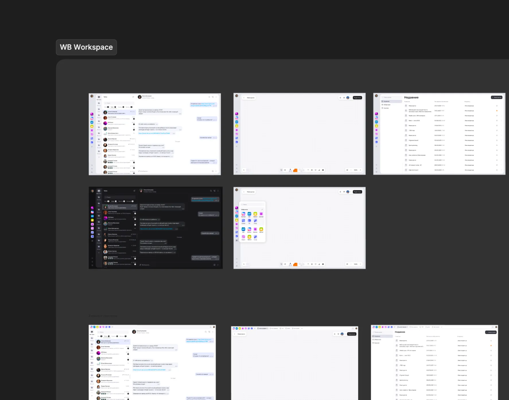
What we shipped into development — a single shell where the product owns its working area and nothing else:
- A persistent app rail, identical across products and anchored in the same place on every screen
- An app switcher with search across apps and a customizable favorites section, so people can pull forward the three or four products they live in daily
- Global elements — search, notifications, profile, and settings in fixed, predictable positions
- A clear line between platform surface and product surface
The case I made to stakeholders wasn’t about consistency. It was about cost.
Approach 2
An agreement about shared navigation falls apart in a few sprints without something holding it in place. Teams ship in parallel, everyone has deadlines, and exceptions accumulate quietly — each one defensible on its own.
Design review against platform patterns. I set up recurring review of product team work, positioned before handoff to engineering, where changes are still cheap.
Written criteria for when a team can break the pattern — and when they can’t. This is the part that mattered most. Without it, review is just opinion and turns adversarial; with it, review becomes something a team can check their own work against before they show up. I also wrote the escalation path: if a team needs a pattern the system doesn’t cover, they don’t invent one locally — they bring the case, and it either resolves into an existing pattern or becomes a new platform pattern for everyone.
A platform patterns sync. I started a recurring session for product designers to align on changes to the platform layer, raise scenarios the system doesn’t cover yet, and work through the edge cases that came out of review.
Outcome
The product hasn’t rolled out yet, so I’m measuring internal adoption and prototype testing:
- The navigation model is agreed across every product team and is in development
- The shell is being built as a reusable layer — new products plug into existing navigation instead of designing their own
- Design review and the patterns sync now run on a regular cadence across product teams
- Prototype usability testing validated the core navigation model: participants could switch products and find the right application successfully
- System disagreements now get resolved against written criteria instead of escalated